This project was developed over a three-week period for my Mobile App Design class, with the goal of reimagining the Operating System camera app experience. The key challenge was to maintain all core camera functions (photo, video, filters, grid, live photos)while completely avoiding the use of traditional button designs. This constraint encouraged innovative thinking around gesture-based controls, contextual interactions, and screen-wide touch zones.
I began the design process by identifying the essential tasks and interactions users expect from a native iOS camera app—capturing photos and videos, switching modes, applying filters, and accessing features like the grid and live photos. With the added challenge of eliminating traditional buttons, I focused on creating a gesture-first experience that prioritized fluidity and minimalism.
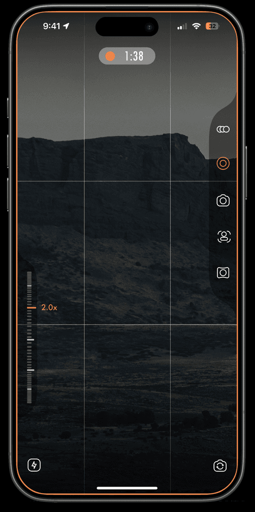
The final prototype showcases a seamless, buttonless camera experience designed to feel both intuitive and immersive. Built with a gesture-first interaction model, users can easily switch modes, apply filters, and access core features through fluid touch-based controls. The interface blends minimal visual clutter with clear feedback, allowing the content to remain the focal point. The final design balances innovation with familiarity, offering a fresh take on the native iOS camera that feels natural, efficient, and visually refined.
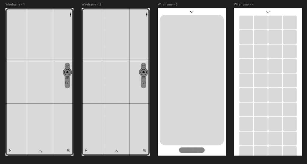

The wireframes laid the foundation for a clean, intuitive, and gesture-driven camera experience. Prioritizing content and minimizing visual clutter, the layout introduces a vertical control dial for toggling between camera modes—Photo, Video, and Filters—while subtle gesture cues replace traditional buttons. Each screen was designed to support a key task: capturing media, switching modes, viewing captured content, and accessing the photo gallery. The use of iconography and spatial hierarchy helped define clear affordances without relying on typical UI elements. This stage was crucial in refining the interaction model and setting the tone for the final prototype’s visual direction.
Moodboards
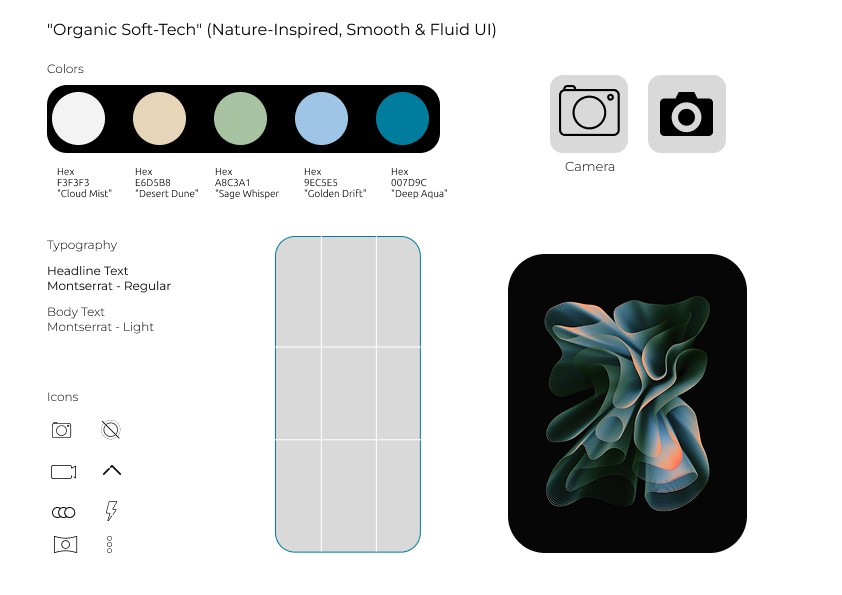
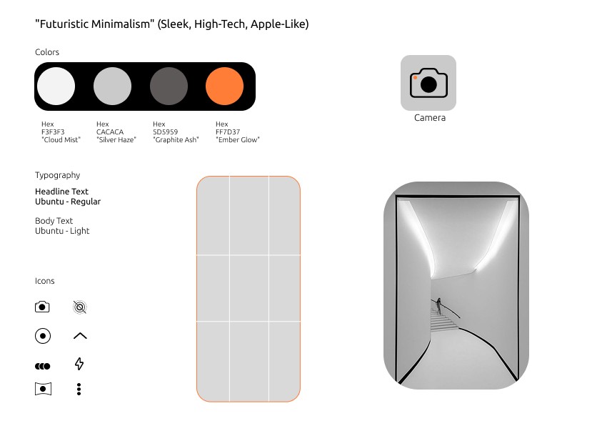
To establish distinct visual directions for the camera app, I developed two contrasting mood boards exploring both aesthetic and interaction styles. The first concept embraced earthy, calming tones—featuring warm neutrals, soft greens, and sand-like textures—to evoke a grounded, lifestyle-focused feel. It leaned into minimalist iconography, rounded typography, and soft UI elements for a natural, calming experience. The second, more experimental direction was ultimately set aside but helped push the boundaries of what a camera interface could look like. These mood boards played a key role in defining the tone, palette, and micro-interaction style of the final design.