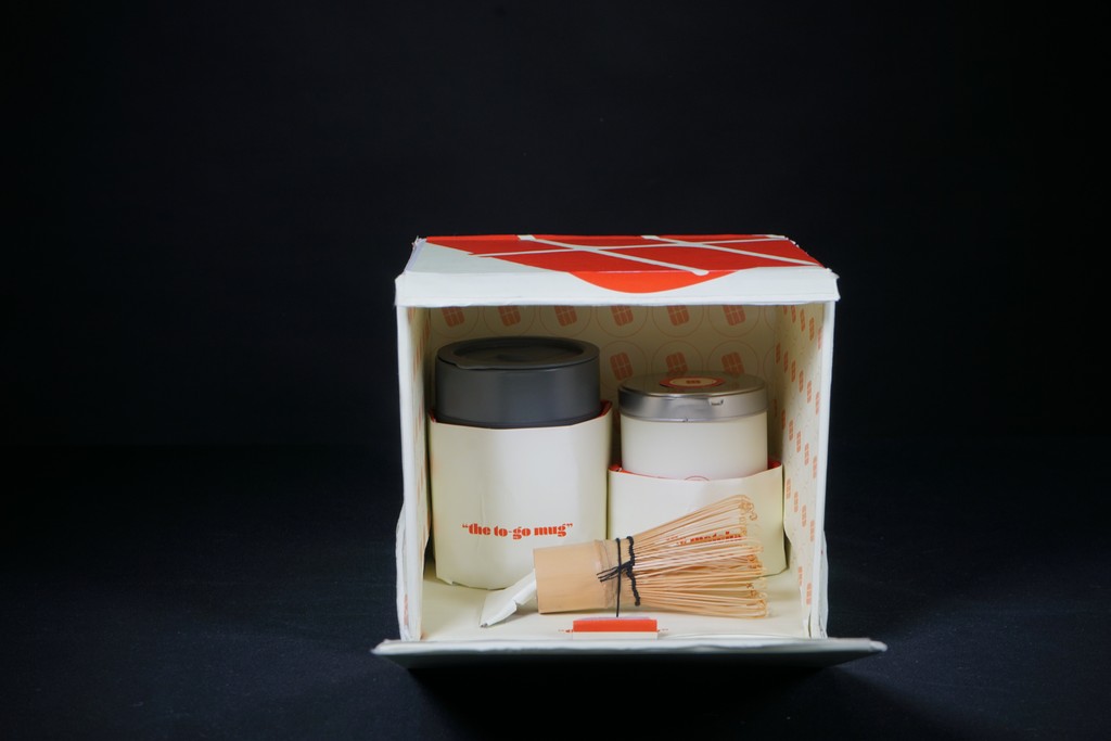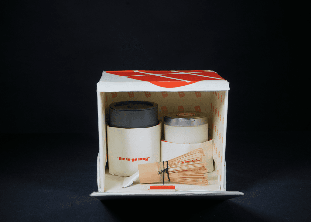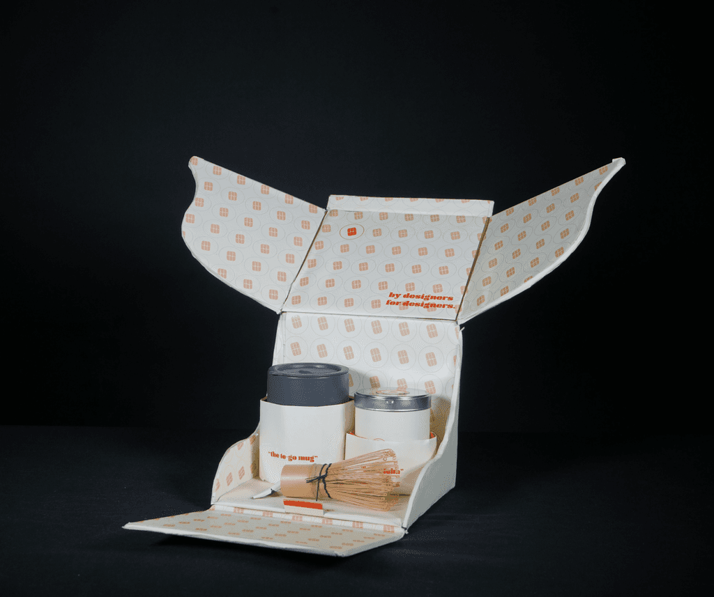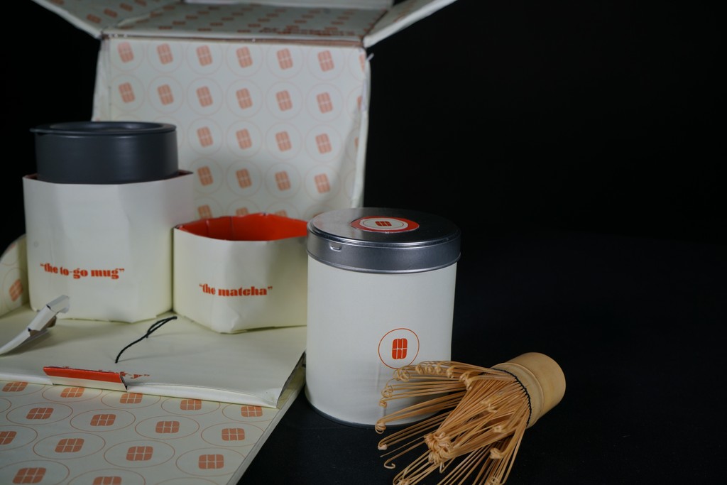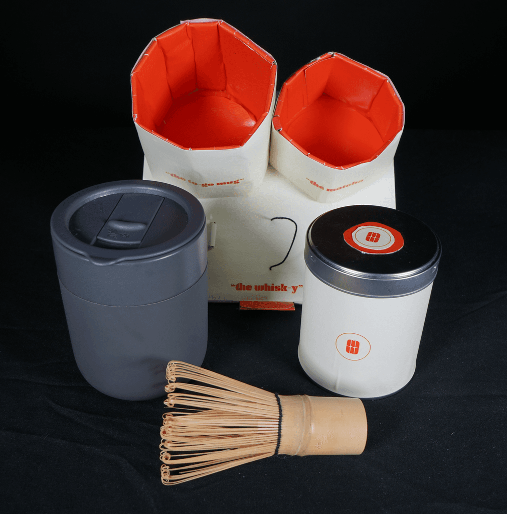
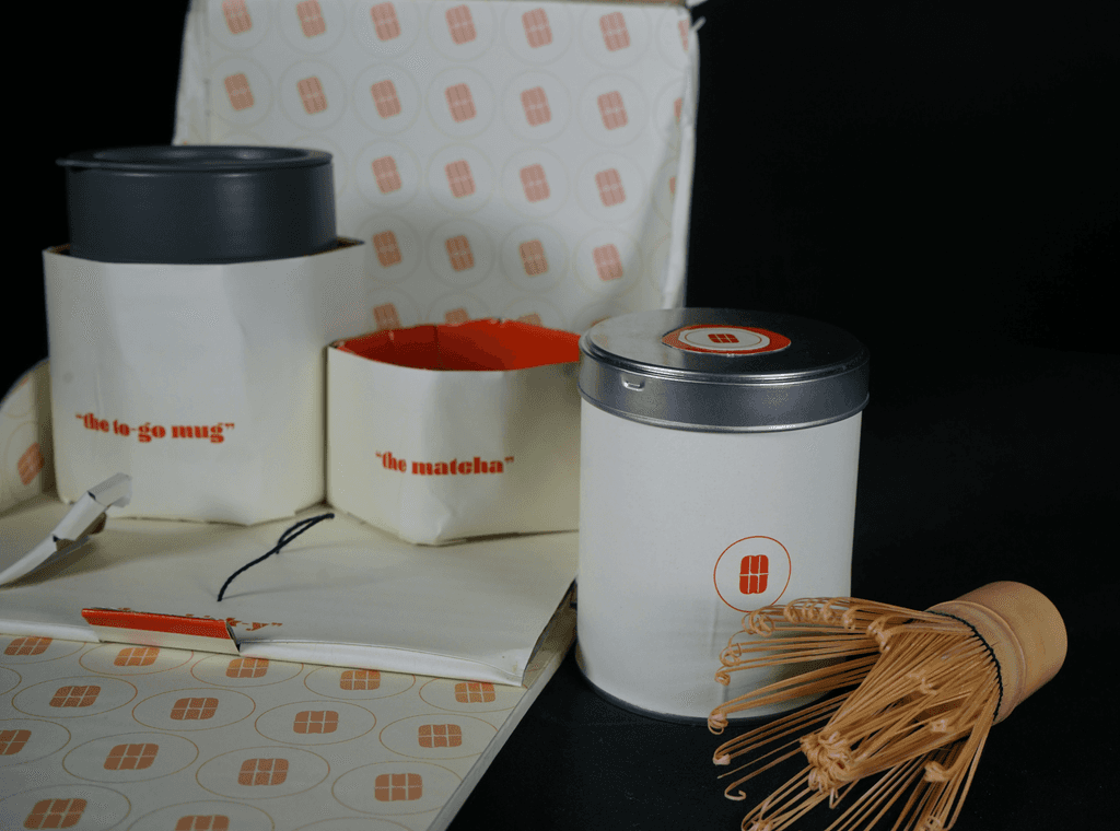
During my packaging class, the goal was to design a starter kit featuring three essential items for graphic designers. I chose matcha as the focal point, believing that every designer benefits from the steady and calming energy it provides. My kit includes a tin of high-quality matcha, a bamboo matcha whisk for preparation, and a to-go mug—perfect for fueling creativity on the go.
The project began with the inspiration to create a brand and logo tailored specifically to designers, rather than exclusively targeting matcha drinkers. Over the span of three weeks, I developed the concept through a progression of lo-fi to hi-fi prototypes, culminating in polished digital mockups.
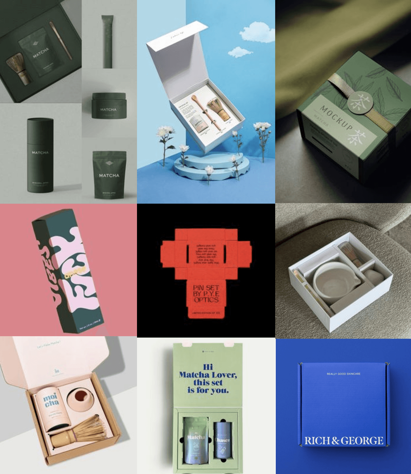
Moodboard
The Matcha Mode mood board blends sleek, minimal design with natural, earthy tones, reflecting the product’s dual purpose: energizing creativity and connecting to nature.
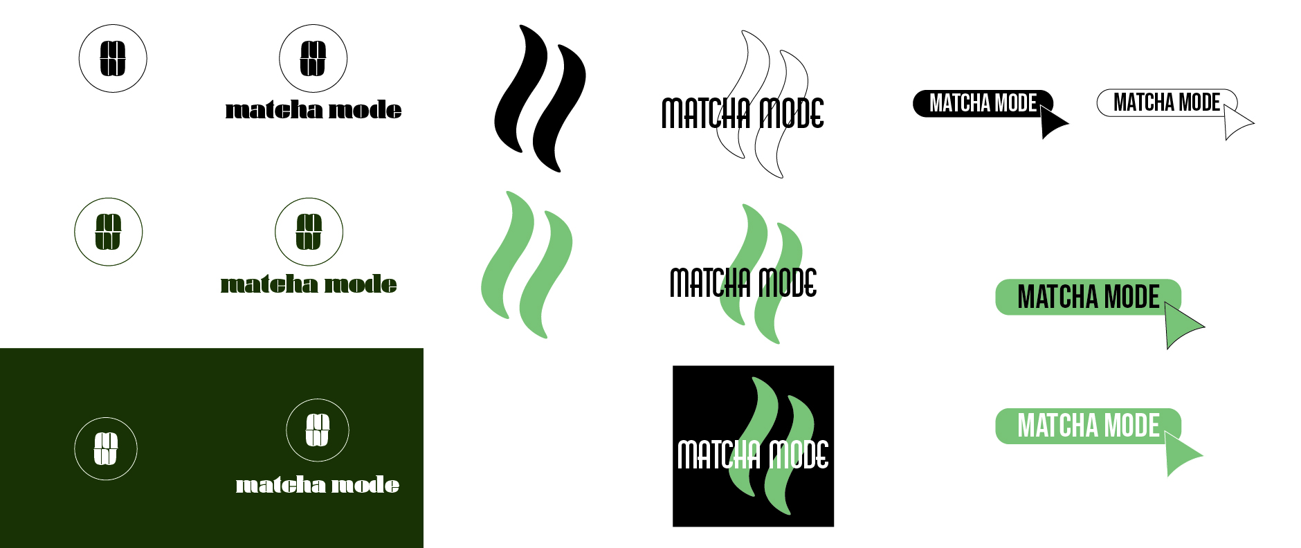
Initial Logo Explorations
The initial logos for Matcha Mode explored the balance between matcha-inspired visuals and a design-focused identity. Feedback revealed that the designs, particularly the color choices, leaned too heavily toward matcha enthusiasts. This prompted a shift toward creating a brand that resonates with designers, blending the calming essence of matcha with bold, creative elements. The name "Matcha Mode" ties it all together, referencing design tools like "blend mode" and the idea of being in a focused, creative zone.

Final Logo
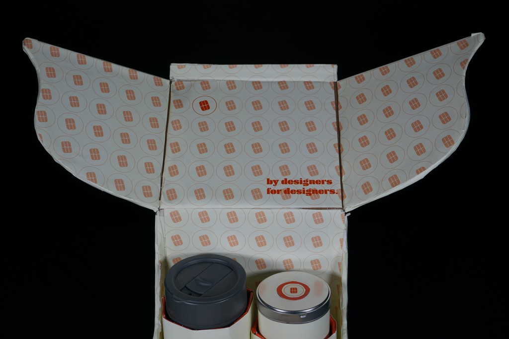
The final Matcha Mode logo reflects the perfect synergy between matcha’s natural, calming qualities and a designer’s bold, creative spirit. The circular emblem paired with minimal, geometric shapes conveys simplicity and balance, while the vibrant red hue adds a modern, energetic twist to stand out. The design prioritizes adaptability, working seamlessly across patterns, packaging, and digital applications, making it both functional and visually striking.
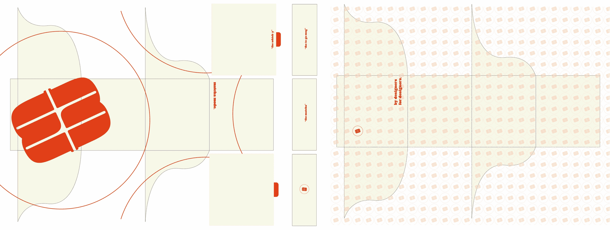
Dieline
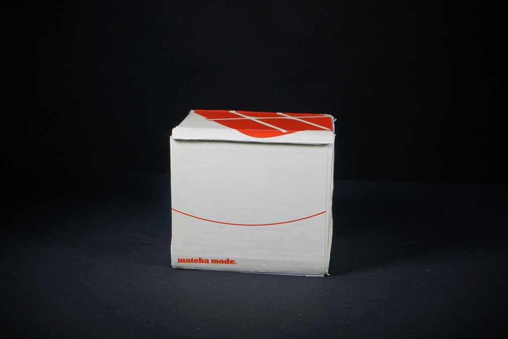
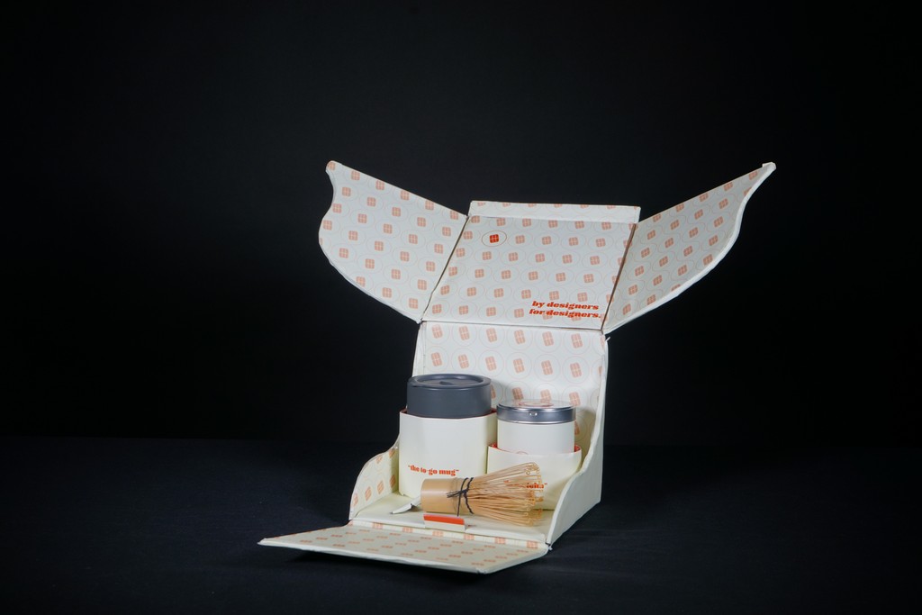
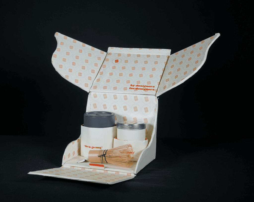
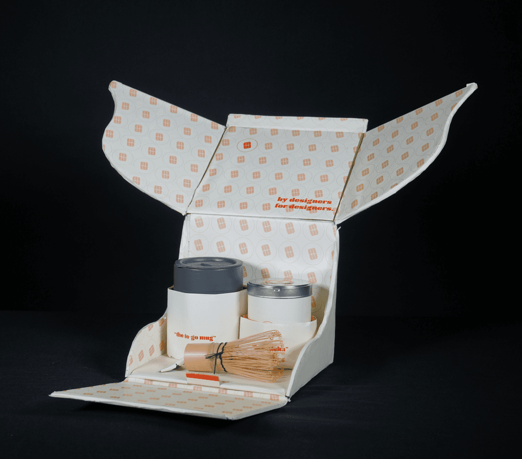
The dieline for Matcha Mode was carefully designed to ensure functionality and an engaging unboxing experience. It incorporates precise folds and cut lines to securely house the matcha tin, whisk, and to-go mug, while maintaining a sleek and minimal aesthetic. The dieline also reflects the brand's commitment to tailor to designers with efficient packaging, aligning with the values of designers who appreciate both form and function.
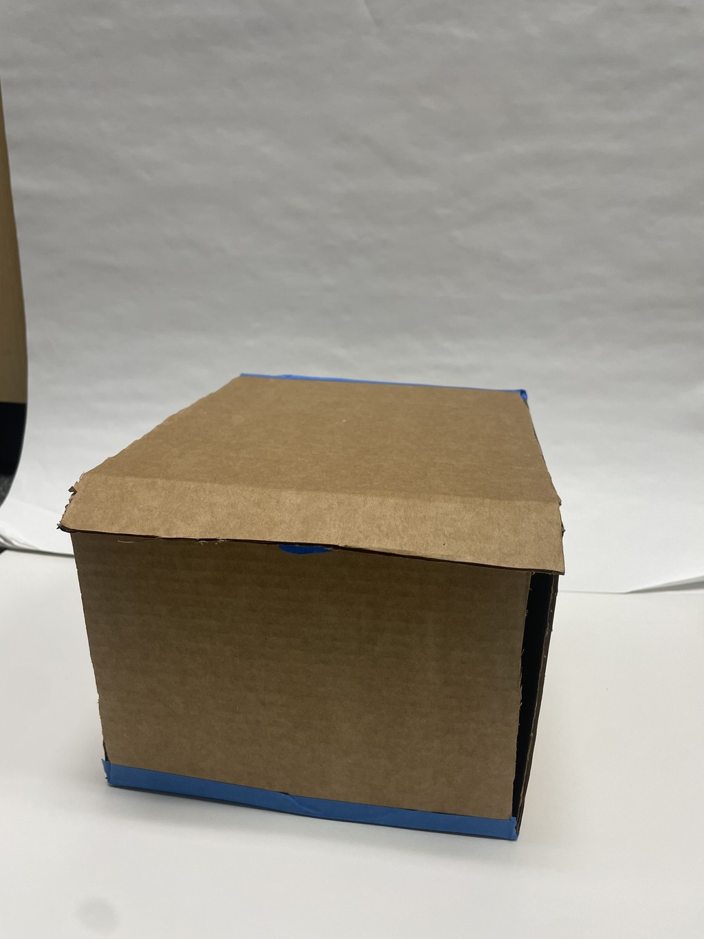
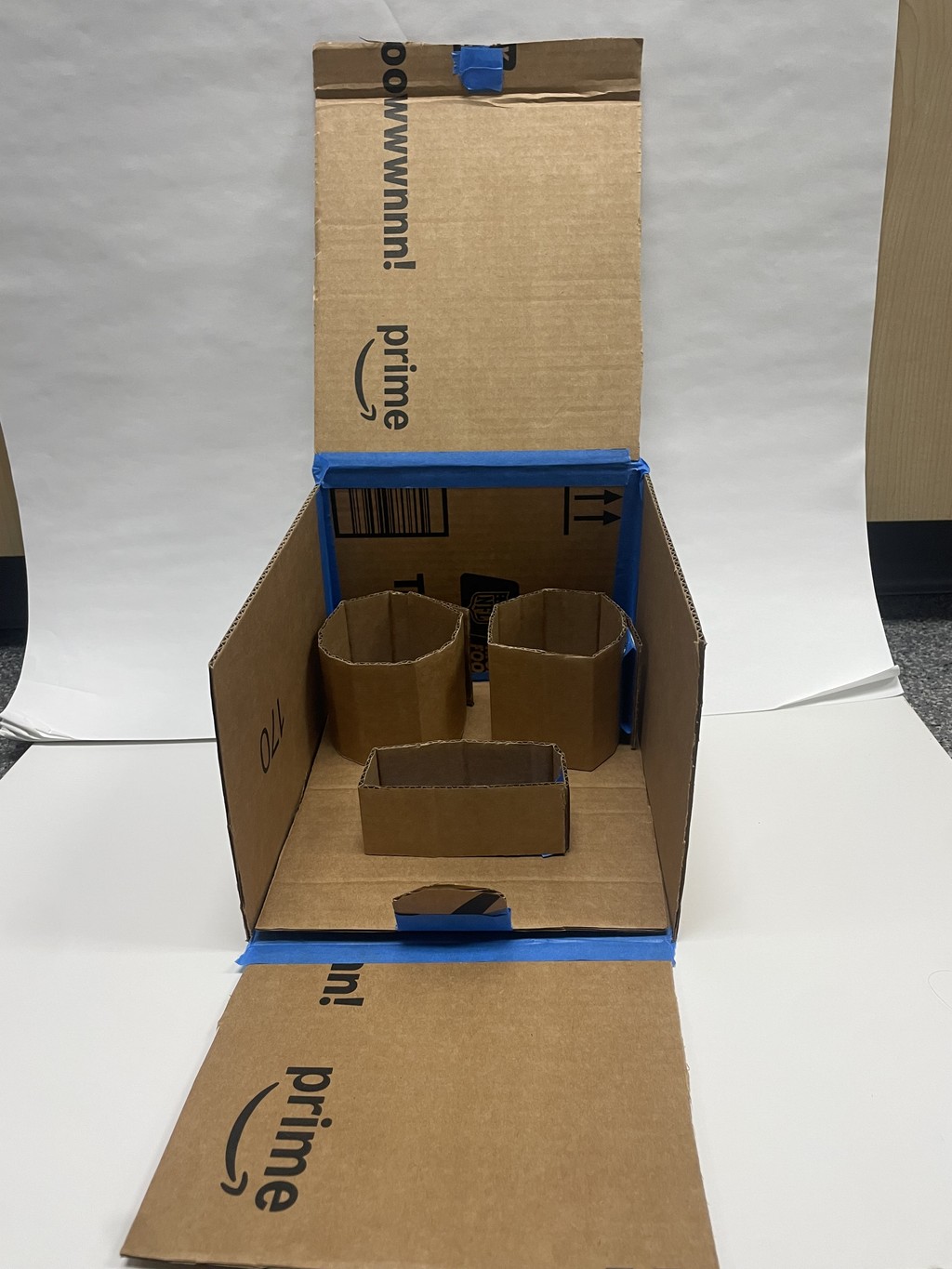
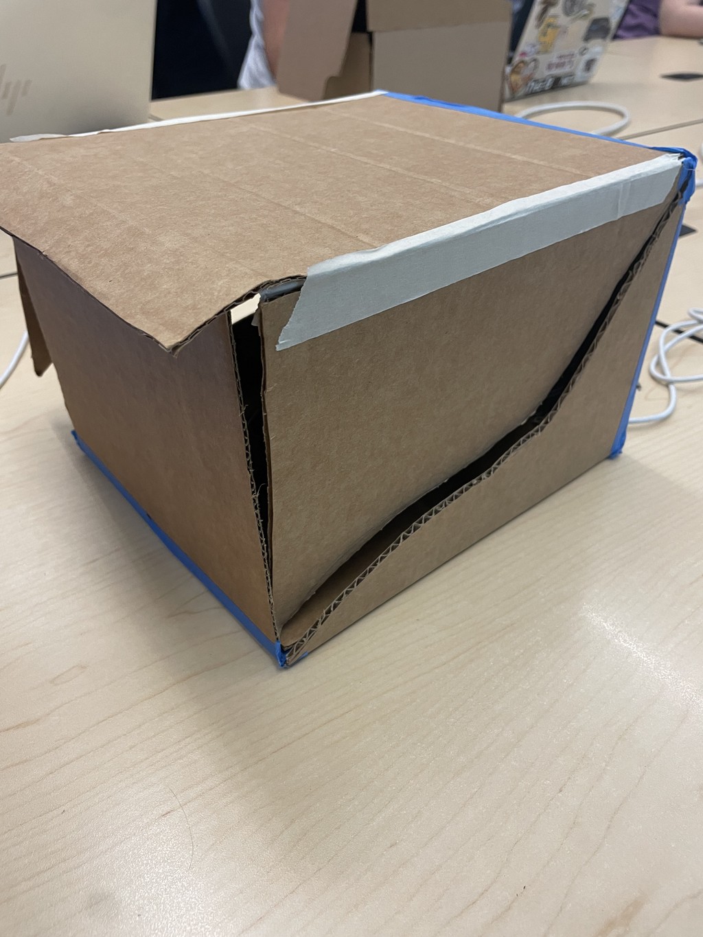
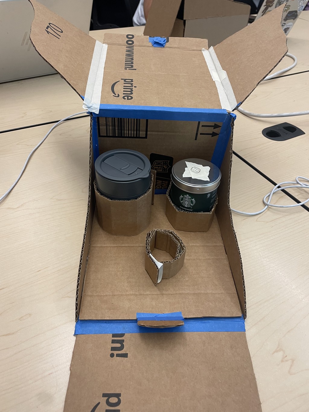
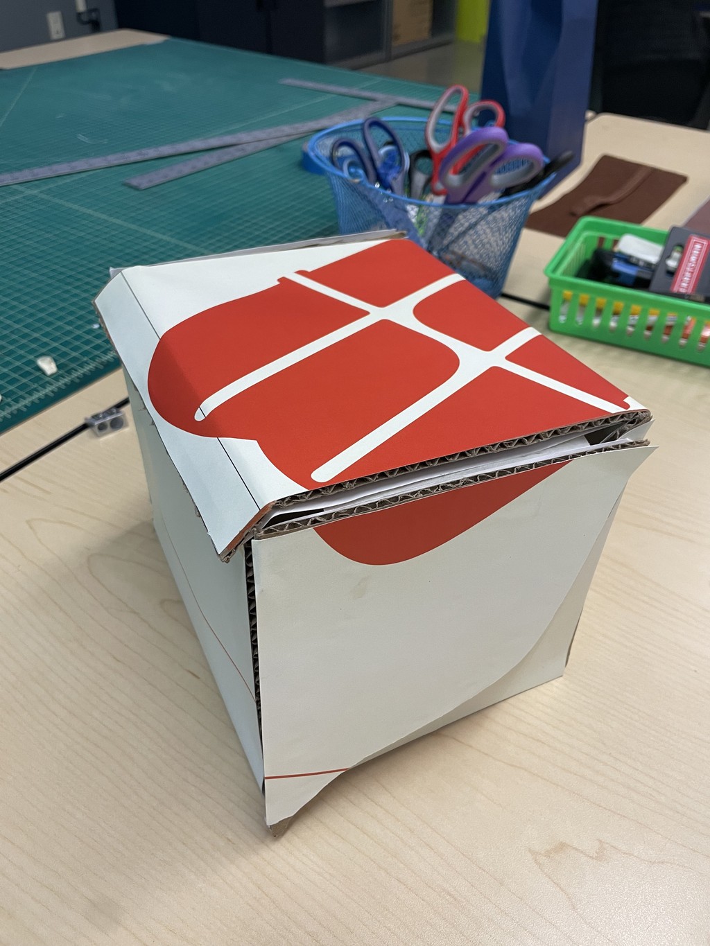
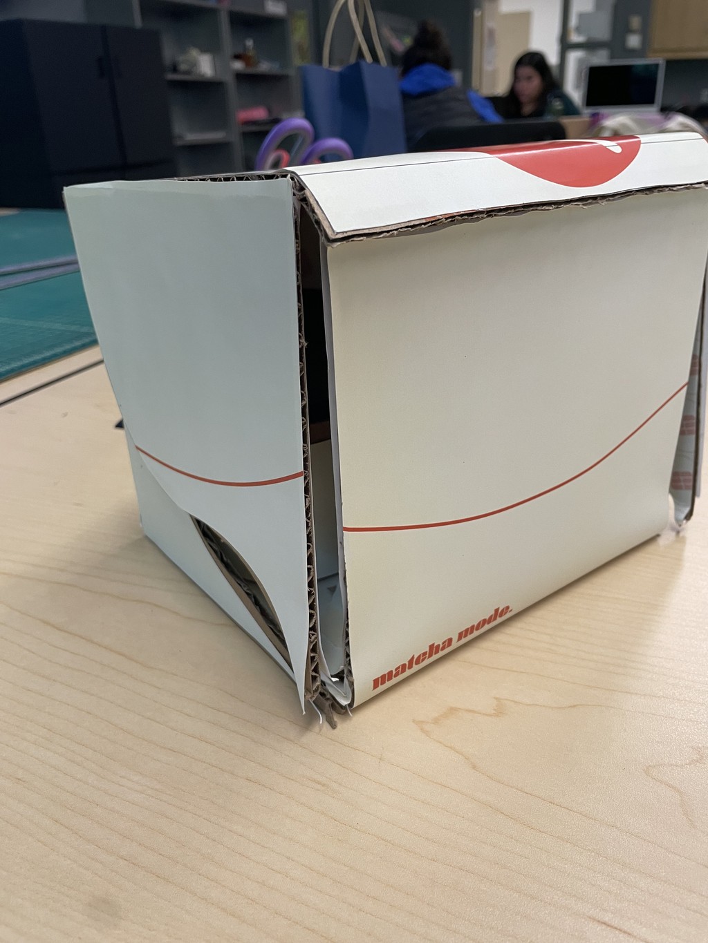
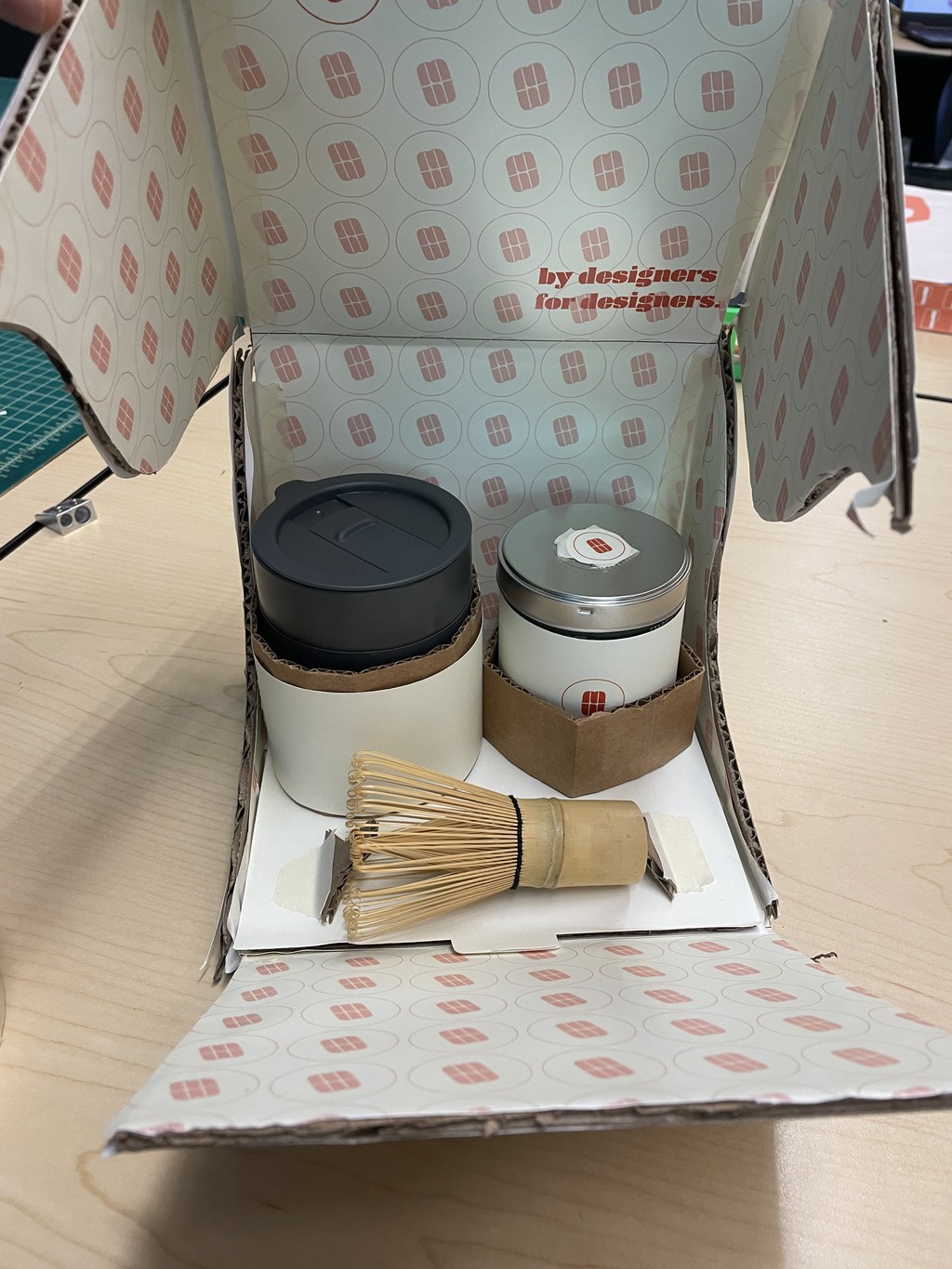
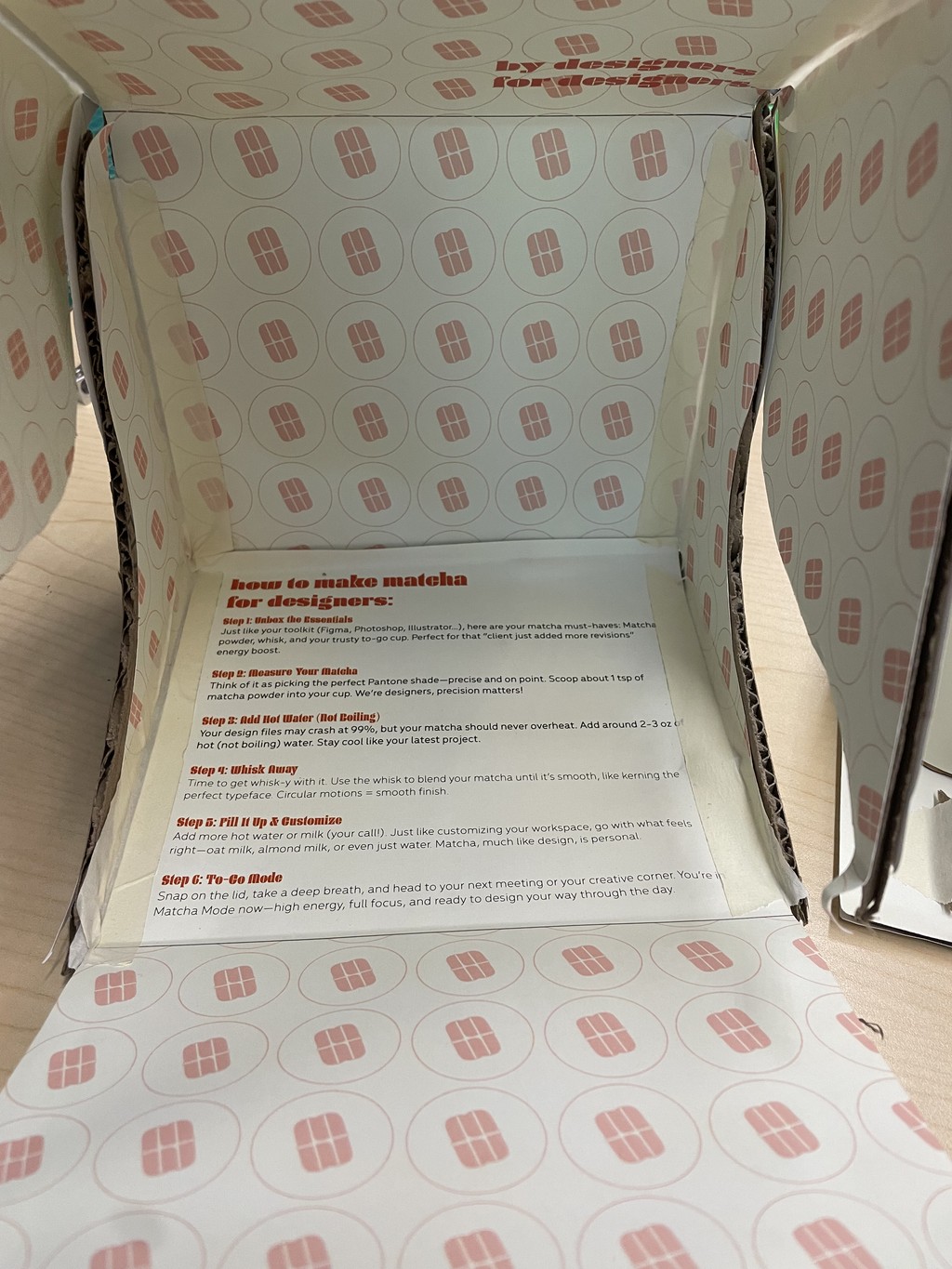
The Matcha Mode packaging journey started with lo-fi prototypes crafted from cardboard, with printed designs glued on to test aesthetics and functionality. I particularly liked how the design wrapped seamlessly around the box and the inclusion of patterns on the interior, creating a cohesive experience. Each item had its own dedicated compartment, ensuring a neat and organized presentation. However, the lo-fi prototype revealed that the opening mechanism felt tight and claustrophobic. To address this, the hi-fi prototype introduced cut-out sides with "wings," transforming the unboxing into a more open and luxurious experience. Adding a tab not only hinted to the user to pull but also introduced an intuitive slide-out tray, enhancing functionality and elevating the overall user interaction.