Branding / UX

Branding / UX

Branding / UX

POC Sweden AB Identity Redesign &
Brand Guideline

POC Sweden AB Identity Redesign &
Brand Guideline

POC Sweden AB Identity Redesign &
Brand Guideline

Overview

Overview

Overview

In my branding class, I redesigned POC Sweden AB's logo and created a cohesive brand guideline with
a refreshed color scheme and design elements.
Drawn to POC’s focus on athlete safety and innovation,
I showcased the redesign as an interactive website, reflecting their mission to protect lives
and inspire athletes.

In my branding class, I redesigned POC Sweden AB's logo and created a cohesive brand guideline with a refreshed color scheme and design elements. Drawn to POC’s focus on athlete safety and innovation, I showcased the redesign as an interactive website, reflecting their mission to protect lives and inspire athletes.

In my branding class, I redesigned POC Sweden AB's logo and created a cohesive brand guideline with a refreshed color scheme and design elements.
Drawn to POC’s focus on athlete safety and innovation, I showcased the redesign as an interactive website, reflecting their mission to protect lives

and inspire athletes.

Approach

Approach

Approach

I started with a design brief to explore POC’s core values, history, and audience, laying the groundwork for the redesign. Using Adobe Illustrator, I created a logo that aligned with the brand’s identity and mission. Adobe Photoshop helped me craft mockups, showcasing the logo in real-world contexts.
Lastly, I used Adobe XD to design the brand guide as a modern, interactive website.

I began the project by crafting a design brief to understand POC’s core values, history, and target audience. This research served as the foundation for the redesign. Using Adobe Illustrator, I reimagined the logo to better align with the brand’s identity and mission. I then utilized Adobe Photoshop to create mockups, bringing the brand to life through real-world applications. Finally, I designed the brand guide as a website prototype using Adobe XD, ensuring a cohesive and modern representation of the new visual identity.

I started with a design brief to explore POC’s core values, history, and audience, laying the groundwork for the redesign. Using Adobe Illustrator, I created a logo that aligned with the brand’s identity and mission. Adobe Photoshop helped me craft mockups, showcasing the logo in real-world contexts. Lastly, I used Adobe XD to design the brand guide as a modern, interactive website.

Brand Guide Website

Brand Guide Website

Brand Guide Website

Instead of a traditional PDF, I created the brand guide as an interactive website. This format allows for a dynamic and user-friendly experience, making it easier to navigate and visualize the brand’s new identity in a digital context. It also reflects the modern and innovative spirit of POC, aligning with their forward-thinking approach.
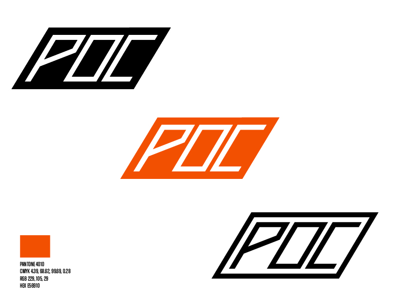
Logo Redesign

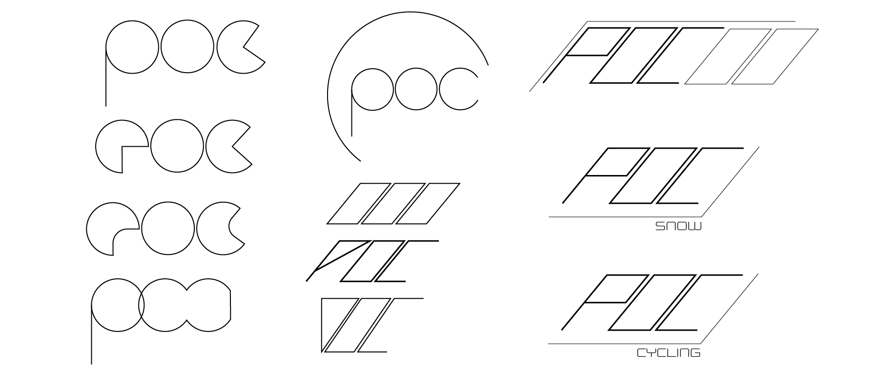
I designed the logo to embody the essence of action, movement, and recognizability. Placing the letters diagonally creates a sense of energy and forward motion, symbolizing progress and innovation—key traits of a sports brand. The bold, sharp lettering conveys strength and confidence, reflecting POC’s commitment to high-performance gear. The orange parallelogram adds a vibrant touch, enhancing visual interest and brand recognition.
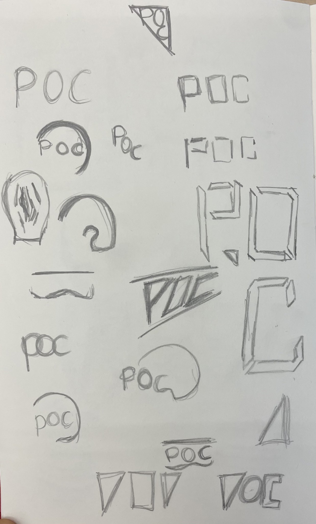
Logo Sketches

Exploring multiple concepts through hand-drawn sketches. This allowed me to experiment with different shapes and letterforms to capture the brand's essence. From bold geometric designs to softer curves, each iteration focused on conveying movement, energy, and recognizability.

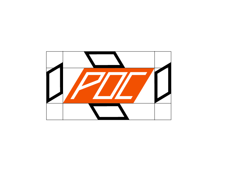
Logo Digital Concepts

I moved to Adobe Illustrator to digitize the designs. This process involved refining shapes, adjusting proportions, and experimenting with typography and color to create a polished, professional logo.

Let's Work Together!